
My name is Max Kirby, and this case study reflects my experience on conducting a small-scale, 3 player, moderated playtest for “District 47: Idle Luxury Tycoon Sim,” a mobile simulation game developed by Derek Kaplan. (Full UX Report Here)

Figure 1: The logo for “District 47” on the app store
The game centers on gem trading, financial strategy, and discovery through a phone-based interface, aiming to deliver an immersive and realistic experience. In May 2025, I conducted a moderated playtest to evaluate the game’s usability, user experience (UX), and player engagement, providing the developer with actionable feedback to refine onboarding, gameplay clarity, and overall UX.
This case study outlines my methodology, key findings, recommendations, and reflections on the process, emphasising lessons learned and strategies for future playtests.
Methodology
I discovered District 47 through Derek Kaplan’s Reddit post on r/IOSProgramming, expressing how they built their “first large-scale solo app/game”. On April 29, 2025, I connected with Derek to discuss a potential playtest.
I began by playing through the game myself to gain a clear understanding of the experience and learn the core mechanics. This helped set expectations for player behavior and informed what to look for during the playtest.
Derek told me that the largest areas that they would like tested were the onboarding, and UX clarity. More specifically – how intuitive the phone interface feels to new players, and whether they understand what to do early on. Derek was also curious about early pacing and whether players felt lost, bored, or hooked in those first 10-15 minutes of playtime.
We discussed a target audience, which ultimately ended up as midcore mobile gamers aged 25–40 who enjoyed idle, tycoon, or sim-style games, but those with an interest in finance will likely connect with it most. Marcus stated that “The finance elements are closer to something like Simcompanies, while the collecting aspect has similarities with Pokémon TCG Pocket“. Their goal was to create an intuitive, self-directed experience with minimal hand-holding, relying on in-game voicemails and contextual cues to guide players.
Derek emphasised that the playtest should focus on onboarding clarity, core loop comprehension (buying, refining, and selling gems), early-game pacing, and feature usability (e.g., the GemEx and Winston Reserve apps). They also sought insights into player motivation and potential friction points to refine the game where possible.
Step 2: Designing My Study Plan
I created a detailed study plan to structure my playtest, see:
District 47 – Study Plan
My Plan Included:
● Player Introduction: This guide is intended to help players to prepare for the playtest. It includes step-by-step instructions for installing the game, outlines what you’ll be doing during the playtest, and lets you know what to expect throughout the experience.
● Moderation Table: My study plan included a table titled “During the Session”, where I outlined questions I could ask players live, such as “What do you expect this app to do?” or “How smooth are you finding the interface?”. There’s also a section for signs to look out for, such as visible or audible emotion from the players.
● Survey: An 11-question post-playtest survey to assess objectives, navigation, engagement, and pain points
● Focus Areas: Onboarding and UX clarity, core loop engagement, early pacing, autonomy vs. guidance, and feature comprehension.
This playtest method offered several key advantages, most notably the ability to guide players when they struggled to understand a core mechanic or were unsure of where to go next. I was able to gently steer them in the right direction with subtle prompts and encouragement.”
Step 3: Conducting My Playtest
To conduct the playtest, I partnered with PlaytestCloud, using their platform to recruit three participants who closely matched Derek’s target audience: midcore players of idle tycoon simulators. Since this exact genre wasn’t listed, I selected the most relevant alternatives: “idle clicker games,” “simulation,” and “strategy.” We also aimed for gender diversity, selecting a 2:1 male-to-female ratio to reflect inclusivity within the small sample size.
I submitted the playtest request on May 4, 2025, and scheduled five sessions for the following day, three primary sessions and two backups in case of no-shows or last-minute cancellations. Each session was recorded, capturing both gameplay and the players’ think-aloud commentary, as per my study plan.
The playtest was structured into three moderated 25-minute sessions. Each player was allocated 15 minutes to engage with the game while thinking aloud, sharing their thoughts, feelings, and observations in real-time. The final 10 minutes of each session were reserved for a post-playtest survey.
I personally attended all live sessions. At the start, I briefed each participant on what to expect, explained the goals of the session, and asked for their verbal consent to use their feedback in a report or case study. I made it clear that their responses would remain anonymous, and emphasised the importance of vocalising all their thoughts during gameplay.
Throughout the sessions, I took detailed live notes. When moments of silence occurred or when additional insight was needed, I asked relevant questions from my study plan to prompt further reflection. At the end of each session, I walked the player through the survey questions, collected their final feedback, and thanked them for their time and contribution.
Step 4: My Data Analysis Process
● Note Taking: During the live playtest sessions, I took detailed notes in real time using a notes app on my computer, saving each participant’s observations in separate files to stay organised. In addition to live observations, I also recorded player responses to the post-playtest surveys and stored them in the same notes app.

Figure 2: Example of live notes being taken down during the moderated playtest
● Organising Data: Once all the data was collected, I transferred both the live session notes and survey responses into a Miro board to begin the analysis phase. I organised feedback into themed sticky note categories, such as Onboarding & UX Clarity, Core Loop Clarity, and Early Pacing & Player Motivation. Each note was colour-coded by severity level (e.g., Positive, Low, Medium, Serious, Critical) to help visually prioritise the most important issues. (See Attached Miro Board)
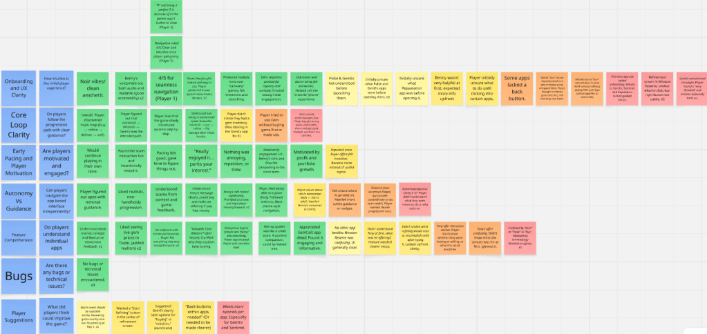
Figure 3: Miro board used to categorise playtest feedback by theme and severity.
This structured approach allowed me to quickly identify key patterns and insights while making the data easy to interpret for reporting. Not every piece of feedback made it into the final report, only the most relevant and high-impact findings were included, especially those that aligned with the developer’s goals.
Occasionally, if I missed or wasn’t sure about a player’s comment during the session, I referred back to the session recordings to ensure accuracy. This ability to revisit footage proved invaluable for capturing nuanced feedback that may have been overlooked in real time.
● Survey Analysis: To supplement my video analysis, I closely reviewed the post-playtest survey responses, incorporating both quantitative data (e.g., 1–5 scale ratings) and qualitative feedback (free-text responses). This helped validate my live observations and provided deeper insights into player opinions, particularly those that may not have been clearly expressed during the sessions.
I used the 1–5 rating scale data to create visual graphs, making trends in player sentiment easy to identify and compare across participants.
Step 5: Compiling My Report
I compiled all of my findings into a comprehensive UX report titled “District 47 – UX Report,” structured around the key focus areas of the study. The report featured a severity key to help prioritise issues, along with visual graphs and player paraphrases to support and illustrate my observations. I presented the final report to Derek using Google Slides, where I walked him through the insights and recommendations. He found the feedback valuable and expressed plans to address the most critical issues in upcoming development iterations.
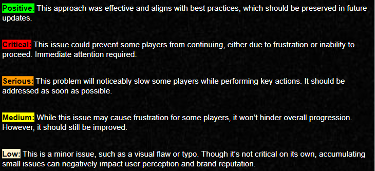
Figure 4: Severity key used to categorise playtest findings for “District 47,” defining Positive, Critical, Serious, Medium, and Low issues
Key Findings from My Playtest
Onboarding and UX Clarity
● Positive: Features like transcribed voicemails and a seamless setup process enhanced clarity and accessibility, reinforcing the sense of realism and personal connection to the in-game world. (District 47 – UX Report, Slide 8).
● Positive: The game’s noir aesthetic, realistic tone, and intuitive phone interface combined to create a highly immersive experience that players found believable and engaging from the start. (District 47 – UX Report, Slide 9).

Figure 5: A graph showing the survey results to the question “How easy was it to navigate through the menus and interface? (Scales 1-5)
(District 47 – UX Report, Slide 9)
● Critical: A usability issue was identified in the Winston Reserve app’s Pending Reveal screen, where players consistently found the interface unclear. The action to reveal a gem is tied to a small, unlabelled icon in the top-right corner, and the main screen displays only a vague “Pending Reveal” message without any clear call-to-action. This led players to mistakenly believe the process was automatic, causing unnecessary waiting, confusion, and frustration. In some cases, this lack of clarity risked breaking the gameplay flow or even prompting players to abandon the game.

Figure 6: The pending reveal screen in the Winston Reserve app, with an arrow pointing to the unclear button. (District 47 – UX Report, Slide 10)
● Critical: The lack of onboarding for first-time users in apps like Winston, GemEx, Sentinel, and Reputation, results in players struggling to understand their purpose due to the absence of tutorials or guided prompts. As a result, players often feel overwhelmed, relying on trial-and-error to navigate the apps. This initial confusion can lead to frustration, increasing the risk of disengagement or abandonment. (District 47 – UX Report, Slide 11)

Figure 7: On the GemEx app’s Earn screen, players struggled to understand the interface and what their goal was.
(District 47 – UX Report, Slide 11)
● Critical: The “Earn” and “Trade” tabs in the GemEx app are unclear and ambiguous, as players expect standard “Buy” and “Sell” labels but instead encounter confusing terminology. It fails to clarify that “Earn” involves fulfilling requests and “Trade” is where gems are actually purchased. As a result, players often misinterpret the “Earn” tab as a way to acquire gems rather than give them. (District 47 – UX Report, Slide 12)

Figure 8: The Earn and Trade options are unclear to users, as they would rather a buy and sell option for clarity.
(District 47 – UX Report, Slide 12)
● Serious: The placement of the back button at the bottom of the app is often overlooked by players. This results in players instinctively clicking on the “X” in the top-left, expecting it to navigate them back, as it aligns with typical back button locations. Additionally, some app pages lack a back button entirely, leading to further frustration. (District 47 – UX Report, Slide 13)

Figure 9: The GemEx app’s Earn screen lacks a back button, showing only an “X” in the top-left. All players clicked the “X” expecting to return, but it closed the app, causing frustration.(District 47 – UX Report, Slide 13)
Core Loop Clarity:
● Positives: Players successfully discovered the main gameplay loop, which involves buying gems, refining them, delivering, and selling for profit. They also identified the intended path, following Benny’s voicemail to Winston Reserve and then to GemEx. Additionally, players appreciated the game’s gradual, step-by-step introduction of systems, allowing them to learn and engage at a comfortable pace. (District 47 – UX Report, Slide 16)
● Critical: Confusion in the game’s core loop, blocks some players from completing contracts. Players often buy gems without refining them first or without understanding contract requirements, leading to incorrect purchases and skipped steps. This disrupts progression, causing frustration and potential disengagement. (District 47 – UX Report, Slide 17)
● Serious: Players can access the “Earn” tab before buying gems in the “Trade” tab, which misleads them on where to start. Without onboarding explaining that gems must be purchased in the Trade tab first, players waste time in the Earn tab, unable to progress. This breaks the core loop and leads to confusion, causing frustration and risking disengagement before players learn the correct sequence. (District 47 – UX Report, Slide 18)
Early Pacing and Player Motivation
● Positives: The pacing was well-received, allowing ample time for exploration and understanding. Positive feedback highlighted strong initial motivation, with players expressing enjoyment and interest. Benny’s calls and the narrative flow were compelling, enhancing player investment. Motivation was driven by profit and portfolio growth, encouraging continued play. (District 47 – UX Report, Slide 20)
● Medium: Anonymous buyer offers appear too frequently without clear limits, overwhelming players with notifications. The high-risk labels and lack of context make the offers feel irrelevant or untrustworthy. As a result, they become distracting noise, disrupting the core loop and slightly affecting engagement, potentially leading to player frustration over time. (District 47 – UX Report, Slide 21)

Figure 10: Three anonymous buyer notifications at once
(District 47 – UX Report, Slide 21)
Autonomy vs. Guidance:
● Positives: Players appreciated the realistic, self-directed progression, enjoying the natural learning experience without excessive guidance. The freedom to explore at their own pace, trusting their instincts, and the intuitive phone-style navigation added to the immersive experience. Benny’s voicemails provided clear structure and direction, motivating players to progress through the narrative, as noted by multiple players. (District 47 – UX Report, Slide 23)
● Critical: Early confusion over objectives and purpose arises from the lack of upfront guidance, objectives, or a clear narrative hook. Without early tutorials or prompts, players are left without context for their actions or goals. This causes players to feel lost and unsure of their purpose, delaying engagement with the core gameplay loop. (District 47 – UX Report, Slide 24)
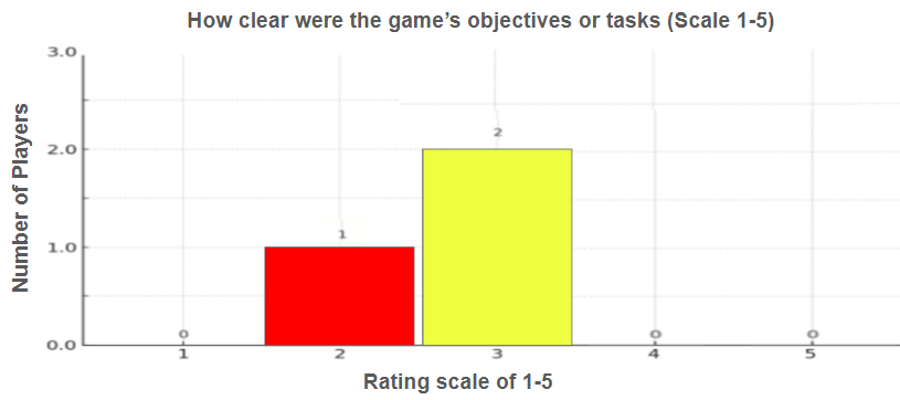
Figure 11: A graph showing the survey results to the question “How clear were the game’s objectives or tasks? (Scales 1-5)
(District 47 – UX Report, Slide 25)
● Serious: Contradictory voicemails create confusion by providing direction but shifting abruptly, such as from Winston Reserve to GemEx, before players can fully engage with the initial prompt. This disorients players, especially when prompted to switch apps before understanding the current screen. (District 47 – UX Report, Slide 26)

Figure 12: Benny prompting to change app before even entering the Winston Reserve app that he just told the player to head to.
(District 47 – UX Report, Slide 26)
Feature Comprehension and Usability
● Positives: Players understood the stock market concept and enjoyed the price movement feedback, with live fluctuating gem prices adding realism to the experience. There was no confusion regarding currencies or resources, and the “Available Cash Balance” label helped clarify how much money players could spend outside their portfolio assets. (District 47 – UX Report, Slide 30)
● Serious: Tony’s offers lack clarity as his contact and offers appear without context or explanation of his role in the game. The purpose of the offers, such as buying or selling gems, is not clearly distinguished from other notifications, leading players to ignore or dismiss them. This confusion over Tony’s intent disrupts immersion and delays progression in the core loop. (District 47 – UX Report, Slide 31)

Figure 13: Tony’s Inventory screen shows his gem prices. All players glanced at Tony’s offers but were scared away, likely due to the lack of tutorials explaining the feature.
(District 47 – UX Report, Slide 31)
● Medium: Players struggled to find their gem inventory because they expected it in the GemEx app, where they buy gems, but it’s only available in Winston Reserve. The lack of onboarding guidance to direct players to Winston Reserve leaves them directionless. As a result, players waste time searching in the wrong app, disrupting their engagement with the core loop. (District 47 – UX Report, Slide 33)

Figure 14: The players diamond inventory, located in the Winston Reserve
(District 47 – UX Report, Slide 33)
Player Suggestions (District 47 – UX Report, Slide 35):
● Batch reveal should be available earlier; revealing gems one-by-one at Rep 1 was frustrating.
● A “Start Refining” button in the center of the “pending reveal” screen in the Winston Reserve app for better visibility.
● GemEx should clearly label options for “buying” vs “missions” to differentiate earn/trade mechanics.
● Back buttons within apps are needed, or existing ones should be made clearer for easier navigation.
● Players want more tutorials for each individual app (e.g., GemEx, Sentinel) to improve understanding.
The Key Recommendations That I Provided:
● The “sparkle” as the refinement button in Winston Reserve is too subtle. It might be helpful to rethink how this is presented to make it more noticeable.
● Direct players to GemEx first, then Winston Reserve. This might help avoid early confusion, as players tend to get prompted to go from the Winston Reserve to GemEx too quickly, and players may overlook the Winston Reserve in this scenario.
● The terms “Earn” and “Trade” are confusing to players. Instead of these terms, players expected simple “buy” and “sell” screens. Clarify and adjust the terminology to make it more intuitive.
● Sentinel is too confusing with no real tutorial. This suggests the need to rethink how this part of the game is presented.
● A more in-depth onboarding system or tutorial would help reduce confusion for players, especially when it comes to app-specific mechanics like GemEx or the other apps.
● Ensure every app has a back button for easier navigation. The “X” should be moved to the top right, with a back button in the top left to follow a familiar computer window layout.
My Reflections and Lessons Learned
This moderated playtest marked a significant shift from my previous unmoderated study, and it introduced me to a completely different set of responsibilities and skills. Unlike unmoderated tests, where data is passively collected and reviewed after the fact, moderated testing required me to actively guide participants in real time, adapt to unexpected challenges on the spot, and maintain engagement throughout the session.
One of the most valuable aspects of this experience was learning how to build rapport quickly and establish a comfortable, conversational environment where players felt free to speak openly. This allowed me to probe more deeply into player thoughts and motivations, uncovering insights that likely would not have surfaced in a self-guided setting.
I also developed sharper observational skills, reading between the lines of participant behavior, tone, and hesitation in real time. Being present allowed me to catch moments of confusion or friction immediately and ask follow-up questions to clarify intent or perception, which greatly enriched the findings.
This format taught me the importance of real-time facilitation, the need for quick thinking, and how to manage time effectively during a live session while keeping things natural and conversational.
Key Lessons Learned:
During this playtest, I encountered a few challenges that provided valuable learning opportunities for future sessions.
● Firstly: I mistakenly submitted the test duration as 15 minutes instead of the intended 25 minutes (15 minutes of gameplay and 10 minutes for the post-play survey). Fortunately, as this was a live moderated playtest, I was able to inform the participants in real time and let them know we would be overrunning the allocated time. All participants were understanding and agreed to proceed, allowing the session to continue without issue.
● Secondly: although I had five backup tester slots reserved, I prematurely cancelled two of them after the first two testers arrived, aiming to be courteous and avoid last-minute cancellations. Unfortunately, one of the confirmed testers then cancelled. I scheduled one replacement the following day and they were also a no-show. This reinforced the importance of keeping backup testers available until all sessions are complete. I now understand the value of maintaining flexibility and will ensure backup testers remain scheduled in the future.
● Lastly: one participant experienced issues with screen recording. They believed the recording was running correctly, and their explanation of the process suggested they followed the proper steps. However, the video was also a black screen when it was received, suggesting a possible technical issue or a misunderstanding of the recording process. To ensure data quality and coverage, I recruited an additional tester to compensate for the missing footage.
Each of these incidents taught me something critical about planning, adaptability, and the importance of redundancy. These lessons will directly inform how I structure and manage future playtests to ensure smoother execution and more reliable outcomes.
Developer Testimonial:
Derek, the developer of D47, shared the following testimonial after working with me on the player experience:
“Max has been a huge asset in refining the player experience for D47. He’s a clear communicator, highly professional, and has a sharp eye for user behavior. His ability to identify areas of confusion has been instrumental in reshaping the game’s early flow.
I genuinely appreciate his thoughtful insights and attention to detail. He’s not just an organizer—he’s a highly valued and talented collaborator who played a critical role in shaping the player experience for D47.”
— Derek, developer of D47
Conclusion:
This moderated playtest for District 47: Idle Luxury Tycoon Sim provided not only a wealth of actionable UX insights for the developer but also a transformative learning experience for me as a researcher. Compared to my previous unmoderated studies, the moderated format revealed the immense value of direct observation, live facilitation, and real-time dialogue. It allowed for deeper exploration into player thought processes, immediate clarification of confusion, and a more nuanced understanding of friction points within the user experience.
From building rapport with participants to adapting on the fly during technical or logistical issues, I gained a range of new skills, moderation techniques, live interviewing, behavioral observation, and time management, that simply cannot be replicated through asynchronous methods. It became clear that while unmoderated testing is efficient for scale, moderated playtesting offers richer, more contextual insights when depth is the goal.
Ultimately, this experience reinforced the importance of tailored study design, flexibility in execution, and maintaining a user-centered mindset throughout. I look forward to applying these insights and skills in future projects, where the stakes of first impressions and early UX clarity remain critical to a product’s success.
📣 Update – June 2025
Following the new update release of District 47: Idle Luxury Tycoon Sim (v1.2.10), I’m proud to share that I’ve been officially credited in-game for User Research..
This update includes several impactful UX improvements directly inspired by my moderated playtest study. Notably, GemEx now handles order fulfillment exclusively, which helps streamline early-game progression, and players can buy uncut gems directly inside Winston Reserve, improving the flow and reducing confusion.
It’s incredibly rewarding to see these research-led changes already shaping the player experience. A full follow-up post will be published alongside the upcoming v1.3 update, which is expected to address a broader set of recommendations.


Leave a comment